

SMER
The Santa Margarita Ecological Reserve (SMER) is a natural reservation located in northern San Diego county. Named after the Santa Margarita river, the reserve is an important center for research and conservation. As part of SDSU’s Field Station Program, its managers have asked me to brand the reserve in an effort to increase the public’s awareness of it.
THE GROVE
There are abandoned orange groves on the outskirts of the reserve territory, and the research biologists have decided that they prefer to sell this organic produce, rather than let it rot away each year. They have come to me with a request to develop an identity system and supporting market assets for the produce, which should all fall under the SMER brand.
DESIGN CHALLENGE
The greatest challenge this project posed for me was working with two connected identities at the same time. Instead of developing one and then the other, I had to juggle between two parallel systems and make sure that they are neither too different, nor too alike.
PHASE ONE
Logos and brand development.

RESEARCH
I looked at logos for natural reserves, parks, and protected areas. I took into consideration businesses that operate on the grounds of protected areas, or that work in partnership with such organizations. I had to design an identity that is positioned at the farmer’s market, so I researched possible competitors that share our positioning.


SANTA MARGARITA ECOLOGICAL RESERVE
The final logo for SMER depicts the reserve’s steep hills, with the Santa Margarita river meandering at their base. The Sun and river are linked, because they are the two powers that work together to bring life to the reserve. I worked with the shape of a dome to signify the protective nature of the reserve.
THE GROVE
The Grove replicates SMER’s shape and utilizes the same colors and typography. I chose a lighter tint of green for this one, to signify the produce’s freshness. A little leaf peaks at the top, waving at whoever’s looking at it. I used the same dome shape here, but I did this to keep a greater link between the two logos.
PHASE TWO
Packaging and asset development.

MARKETING COLLATERAL
The Grove’s main place of operation will be the farmer’s market, where person-to-person transactions will take place. The project managers have a vision of free promotional materials that they can give away. I suggested buttons and tote bags would be great for that purpose due to their low production cost.
I was also asked to design a marketplace tent and business cards, that both show a clear affiliation between The Grove and Santa Margarita Ecological Reserve.
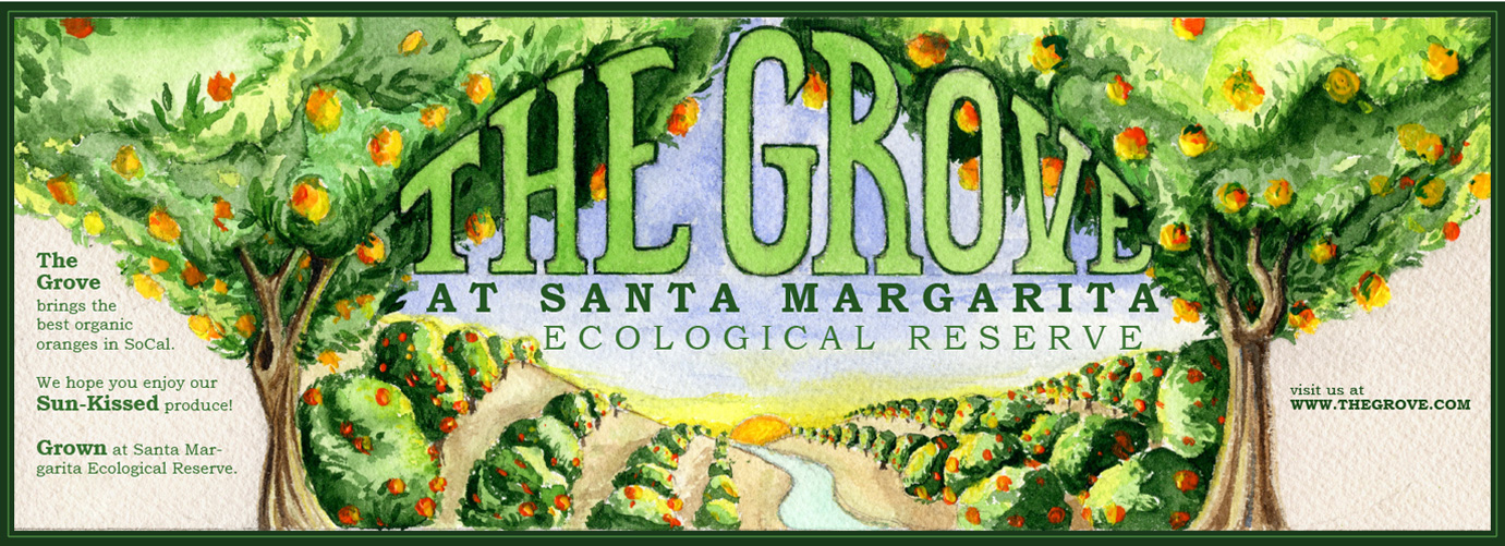
Lastly, I was asked to design a label for the orange crates. The managers were talking about “…those old-timey labels you would see with the painting of the groves and the mountains in the background…” I really liked doing that part, because I love illustrating. I painted a watercolor and scanned it, then digitally added typography.


PHASE THREE
Responsive mobile design.
SMER MOBILE
Let’s go back to the reserve. Its managers want to begin a public outreach campaign, aiming at increasing the public’s awareness of the reserve and its mission. They want a responsive website that helps visitors take the first step to the reserve, and feel interested to visit on location. My target group were people in education - from middle schoolers and college students, to graduates and research scientists.
To achieve accuracy in my design I visited the place on site and took the time to take a guided tour. I took a lot of photographs which I later used in designing the website.
I used a three column grid for the desktop version, two columns for the tablet, and a single column for the phone.